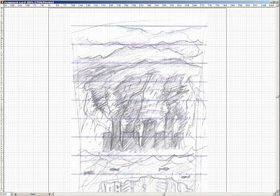
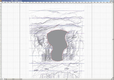
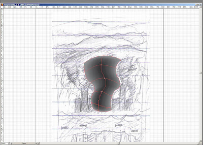
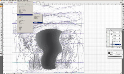
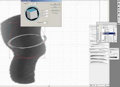
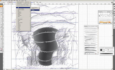
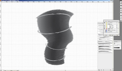
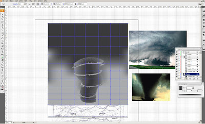
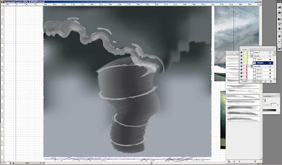
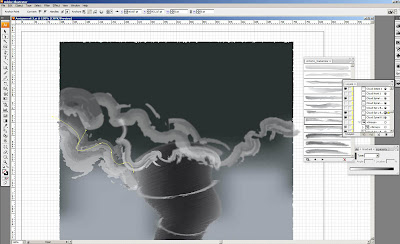
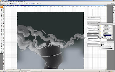
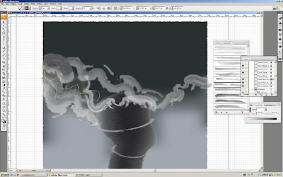
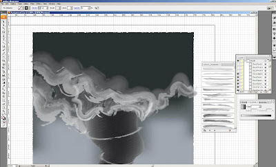
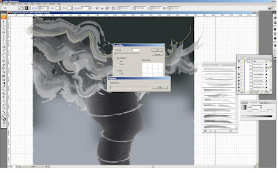
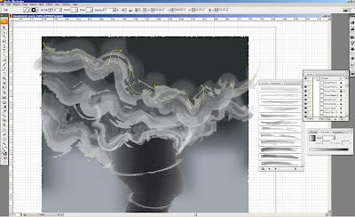
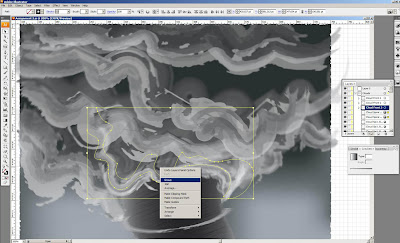
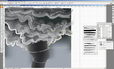
 First, i used back the tornado i drew in assignment 2 and multiply it into 2 of it and edited the sizes of tornadoes.
 Then, I used rectangle tool to draw the buildings and adjusted to make them slanding like going to fall due to the strong tornadoes.
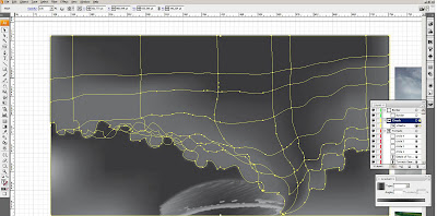
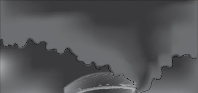
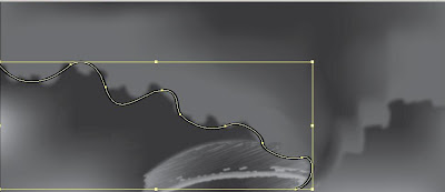
 next, i used the rectangle tool and scissors tool to cut out some strokes of the rectangle and used pen tool to draw the zig-zag as the buildings is broken into two parts.
 then copied and pasted them, i mean multiplied them and place where I think they should be. Then, edit the buildings on the land too using scissors and pen tool. Later, I used the radial blur> zoom effects on the buildings.
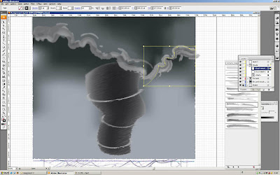
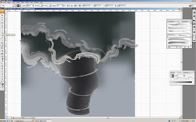
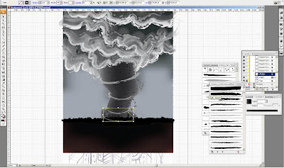
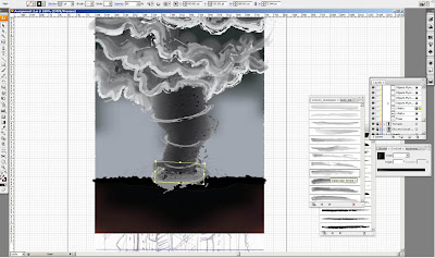
then, I used pencil tool to draw the lines around the tornado, the reason why i didn't used pen tool to draw instead of pencil tool is the lines I drew will become the flying objects later as I change the brush type. And also, used pencil tool to draw instead pen tool will not make it looks stiff for the flying objects.
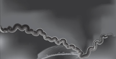
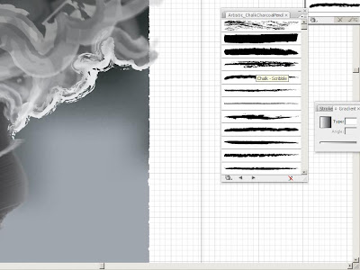
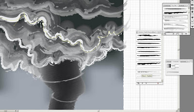
 here you can see, i changed the brush type of the lines spiralling around the tornado to fire_ash brush under the "artistic_ink" brush type.
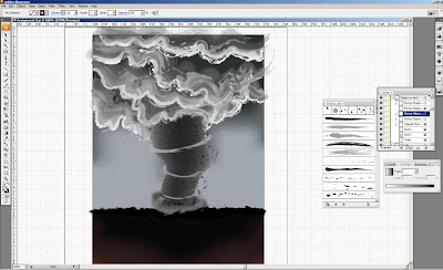
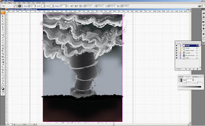
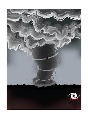
Now, I going to make the another photo for the tornado which is less serious which represent the current tornado. I used the same method I did in assignment to make the tornado, so you can refer the steps on my tutorial of my assignment 2 in my blog. I drew a tornado shape with pen tool as the base colour of the tornado.

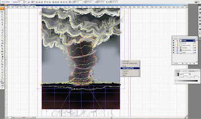
same method... copy another of the same tornado you drew, but u must copy it before you mesh the tornado as I experienced that it cannot allow you to make another copy of it once u mesh it with mesh tool to do the gradient. And I paste a picture of photo beside it to get the colour I want using eye dropper tool.

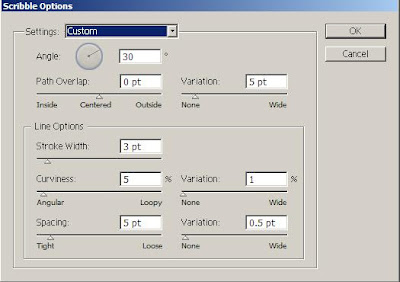
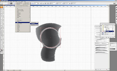
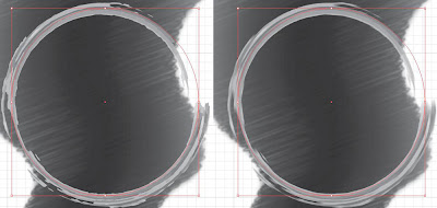
Then, i used the scribble effect on the second copy of the tornado layer. And added outer glow effect on the layer of the base colour of the tornado.
 how I make the spiral dust and clouds around it? refer to my assignment 2, the brush type i used on the clouds and dust are " watercolour_wet" and "watercolour_stroke2" under the "artistic_watercolour" brush type. After that, I used the pen tool to draw the the trees at the back and used the spray tool to make the grass and used the "symbol scruncher tool" to pack the grass close together.
 Okay, i going to say I'm not a person to make things sequently. Thus, now i gone back to the photo of more serious tornadoes and add more details on it, add some lines as smokes on the buildings by change the brush type to "watercolour_wet"
 then added some flying objects or dust around the buildings.
 this is computer error i guess, don't know what's wrong with the print screen. Anyway, i back to the second photo i making and added the dust and flying objects around the tornado also.
 Next, I made two rectangle stroke one these two image and ready to make clipping mask on each of them.
 and again I did mentioned how i make clipping mask in assignment 2, so please refer to assignment two process in my previous post, thank you!
 Almost finish, made the background green and typed few words related to my title and at the last line I put.
 Next, change the colour the words into white and highlighted all the words except the title and changed the opacity of those words to 30%. So, that it clearly showing my title of this poster and able to let audience focus on my title.
 Clipping mask again....
 Okay, I know I skipped a few explanations and steps, sorry but i going to explain here, I used the rectangle tool to make the white border of the two pictures to make them become photos kind and written there "current" and "future". Then, i put my symbol on the bottom right corner and typed the tagline and below put the website link for audience to look for more information about it. And also made two lines to separate the title, the tagline and the website, one is white line with 50% opacity and one is black line.
Last but not least, I want to thank you all for viewing my Computer Graphic blog and also thanks a lot to my tutor, Madam Koo Ah Choo as she taught me a lot of things and now I learnt a lot from her about Adobe Illustrator, so happy =D and sorry if there's any english grammar errors in my blog or my assignments.


